Finally I got down to it and started working on the larger canvases. I am still not on to the biggest but 60x80cm ( appprox 3ftx2.5ft) is stil large enough to force me to work differently. I need among other things to find out where and how to place the paintings while they dry. That needs to be somewhere where the cats can't get to them and where people do not sleep. LOL I need a larger house.
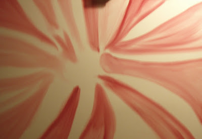
A few of you visiting my blog have told me how much they appreciated a bit of step by step so I will talk you through my painting of this one.
1. Step
I started by covering the whole canvas with a thin coat of socalled liquid white which is a thin layer of white. I did this because I knew that I wanted to blend out colours in this painting so I needed that to help smooth out the red. I wanted the blended look of the organic but I also wanted to play a bit on the modern fractal or digital patterns. Could I combine the organic and the digital? The old and the new? As you can see in the shape to the right which is rounded at the end kind of like a bone and the more angled other red parts I am also in the shapes in two worlds.
2.step
I then blocked

out the basic shapes and lines. I had kind of planned to have a roundish part in the middle and to use lots of white on top of the reds.
3.step
I have not started playing with the inside and also I have smoothed out the whole painting. Nothing is now pure white anymore. In the end I ended up making all the parts more rounded.
4.step. More details, and more smoothing out over and over again.
5. step
I found out that I liked the shape of one of the "curved lines" and made it end into something similar to a viking ship head ( down to the left). I was real happy with that line.

6. step
Now I had to decide a bit more on a proper direction of this painting. Since I liked that "viking ship" shape I started turning the other shapes more into that direction. After having done two more I was sure how I wanted it to progress.
7.step
I wanted the parts to become layered and I wanted them to interact, to touch eachother, to be above or below each other - to meet and to turn in a kind of center area. I had to make the visual look logical to the eye. The lines of a curved shape had to seem to go on on the other side of a shape it lay behind.

8. step
The rest was adding layer upon layer of more red, smoothing it out and then adding a bit more after having walked some steps away to look at it. I did not wnat to go for the very realistic 3D roundness of the shapes but still I wanted some 3D and texture feel of it.
9. step
Doing details, doing the sides better. Very messy job because where are you to hold when everything is painted. LOL.
The last part is making sure that the best side is up in the abstract because even though I paint it one way, sometimes looking at it in other angles makes it into a totally new painting. I have put 2 of the 4 possibilities up here. Which one do you prefer?
The pther two possibilities looked disturbing and I might use ideas from that when I want to make a painting with a more disturbing effect.
SORRY ABOUT THE IMAGE QUALITY. Will take a better one tomorrow or the next day in natural light.
Working title is still "Everything Connects" because I wanted to connect the old and the modern, the natural and the digital in this painting. You are of course free to see what you like. That is the best about abstracts.


 out the basic shapes and lines. I had kind of planned to have a roundish part in the middle and to use lots of white on top of the reds.
 8. step